Context
Skyeng and Skysmart serve thousands of online educators, providing them with tools for scheduling lessons, checking homework, managing students, and accessing professional development courses.
However, as Skyeng scaled to millions of students, the teacher portal became an operational bottleneck. Inefficiencies in the workflow, navigation, and task management led to frustration among educators, increased support requests, and reduced lesson productivity.
Design Lead • Spring 2023 • Skyeng.ru
The Problem: Teachers Spend Too Much Time on Inefficient Tasks
Teacher efficiency is one of the most important business metrics in Skyeng. This means that we need to provide an efficient tool to ensure educators can deliver more lessons with less administrative work.
Our research showed that teachers were spending too much time on low-value admin work:
- 30 minutes of lesson preparation per 50-minute session.
- 20 minutes daily on schedule adjustments and administrative tasks.
- High frustration levels due to fragmented workflows.
This inefficiency had direct business consequences:
- Fewer lessons taught per teacher, limiting revenue per teacher.
- Lower teacher satisfaction, which increased churn and onboarding costs.
- Operational inefficiencies, leading to increased costs.
Based on our interview findings, we mapped out a “Teacher working cycle journey” that shows how much time teachers spend on each step and how these steps help them achieve their goals: delivering inspiring lessons and increasing their income.
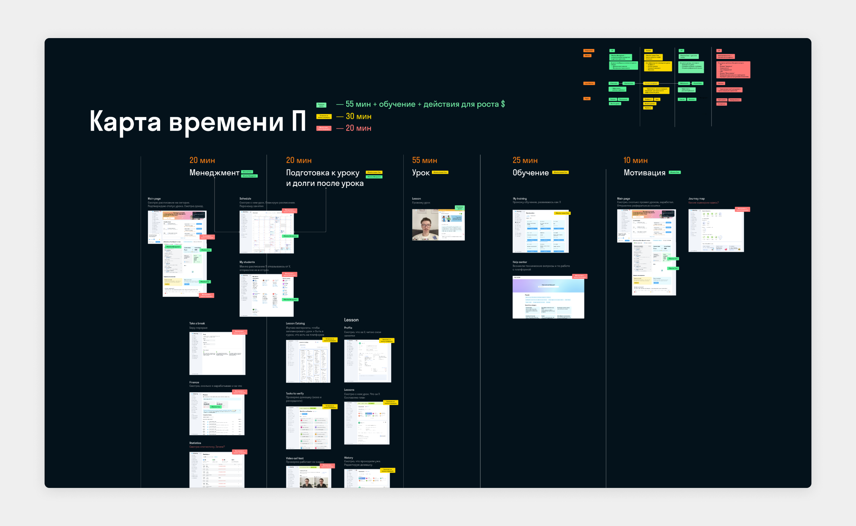
After learning teachers’ needs and insights from the “Teacher working cycle journey,” we came up with 3 main challenges that we have to solve
- Simplicity: How can we simplify navigation?
- Focus: How can we help teachers focus on important tasks?
- Feelings: What can make the product feel less like a tool and more like a partner?
Solution
The first step: generate and validate ideas
To begin, we needed to generate as many ideas as possible. We assembled a small team of four designers, and each one began brainstorming and sketching their concepts.
Our solution focused on three core improvements:
- Reducing cognitive load. Simplifying navigation and surfacing relevant information.
- Minimizing admin time. Automating repetitive tasks and making key actions more accessible.
- Improving the teacher experience. Making the portal feel like a partner, not just a tool.
Home Screen: Feed as the Central Element
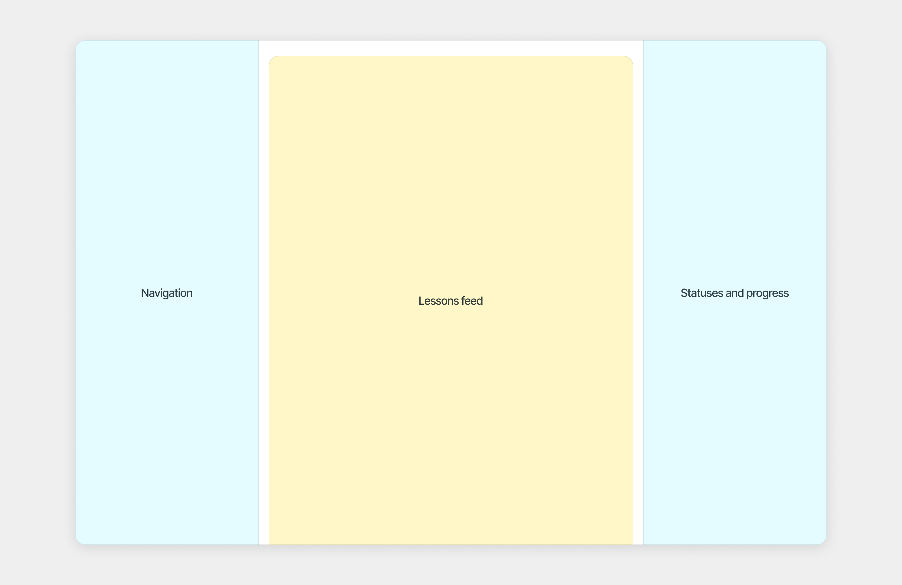
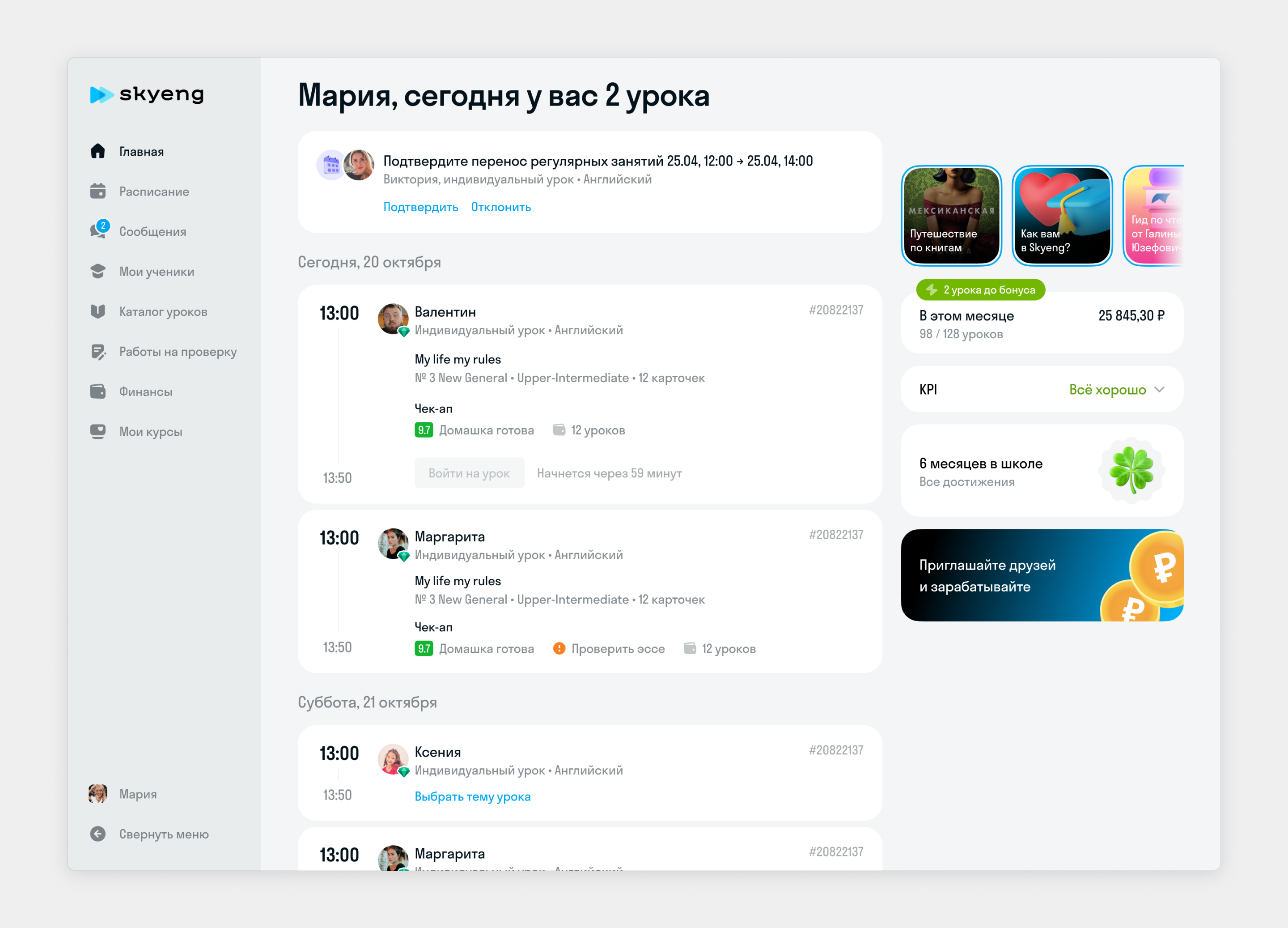
To help teachers focus on essential tasks, we designed a lesson card feed as the central feature of the teacher portal. The main navigation remains on the left side, while the right side displays the teacher’s KPIs, income, status updates, and news.
Our goal was to create a dynamic card that adapts to each step of the “Teacher working cycle journey” and provides teachers with all necessary information and actions. Based on time and context, the card displays information about:
- lesson time and duration
- student information
- next lesson’s topic
- previous lesson details (homework and essays)
- key actions (such as “Join lesson”)

If a student has an unchecked essay or writing task, it will be highlighted when the lesson is scheduled for today.

5 min before a lesson there the only one button is active “Join the lesson”.

If the lesson started there, the same “Join the lesson” button with an active time progress

The card for next day’s lessons displays only the time, student information, and lesson topic.

For lessons scheduled more than one day in advance, the card collapses to a compact state showing only the time and student information

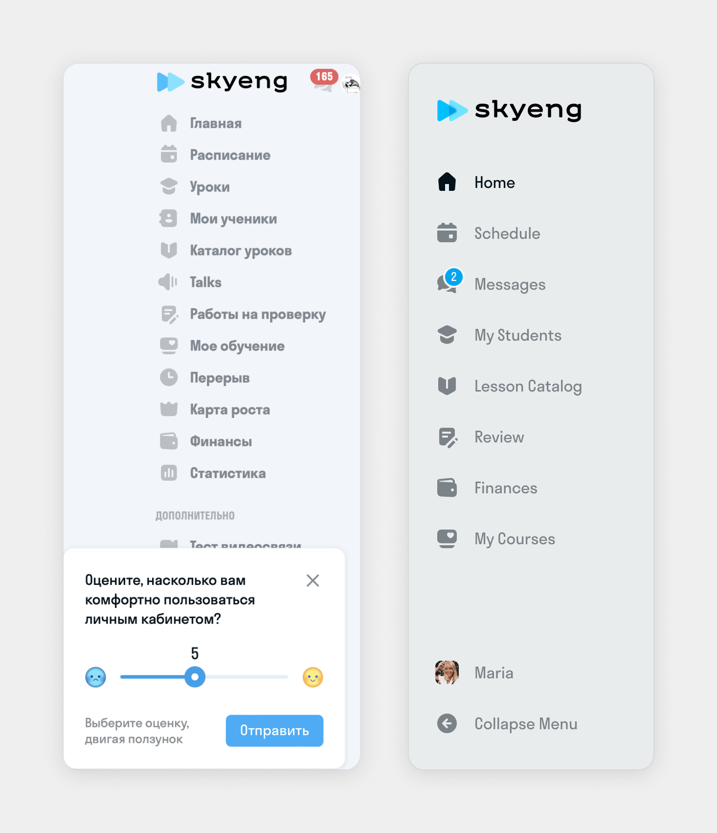
The navigation menu
Based on quantitative data and teacher feedback, we removed unnecessary menu items and added more contrast. This helps make navigation through the menu easier and provides space for future growth.
Personalization: Creating an Emotional Connection
To show that the teachers’ portal is more than just a task management tool, we added fun and personalized elements to create a more engaging experience that teachers can connect with emotionally.
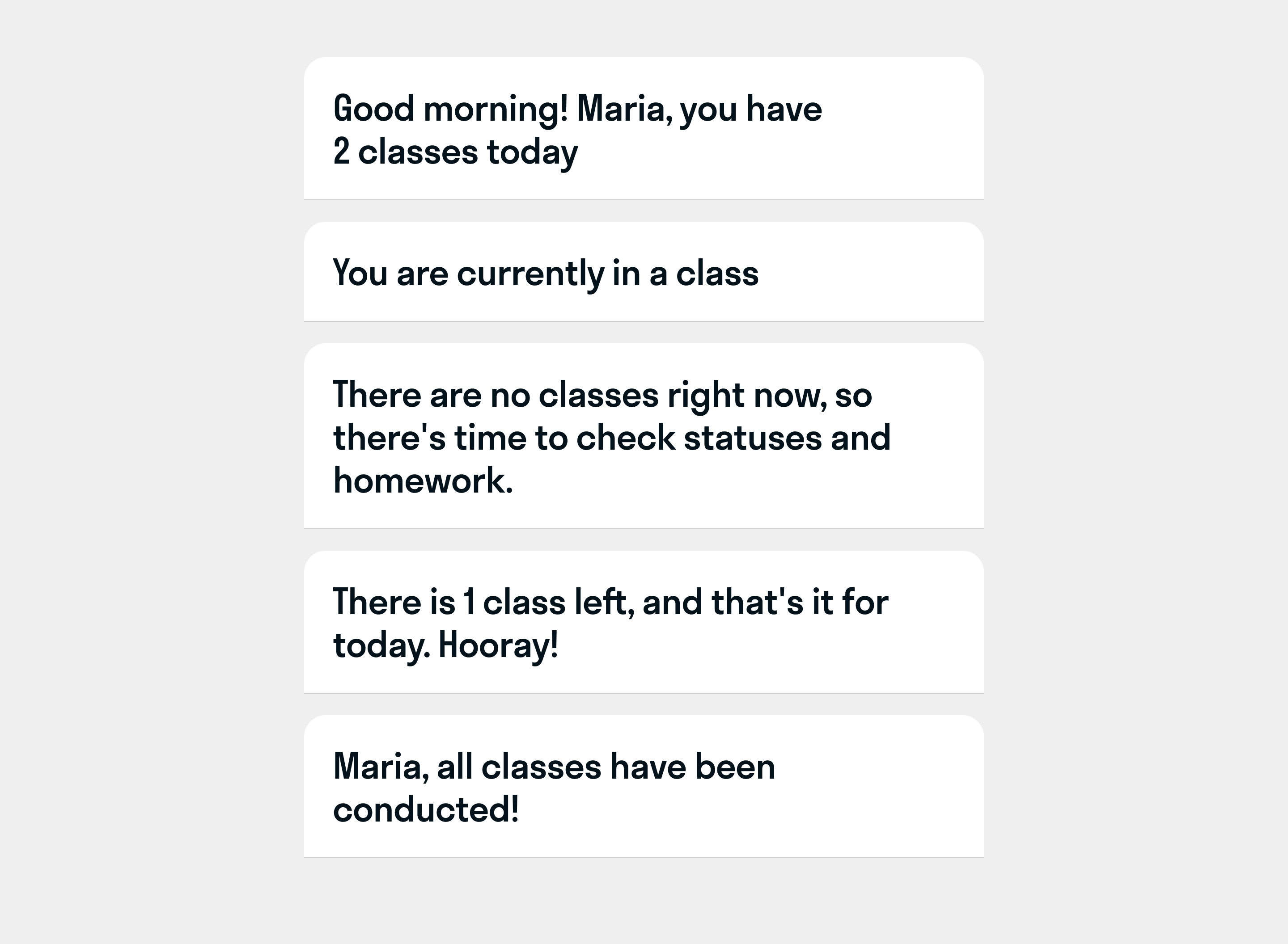
We created a dynamic headline that changes based on the time of day and number of remaining lessons
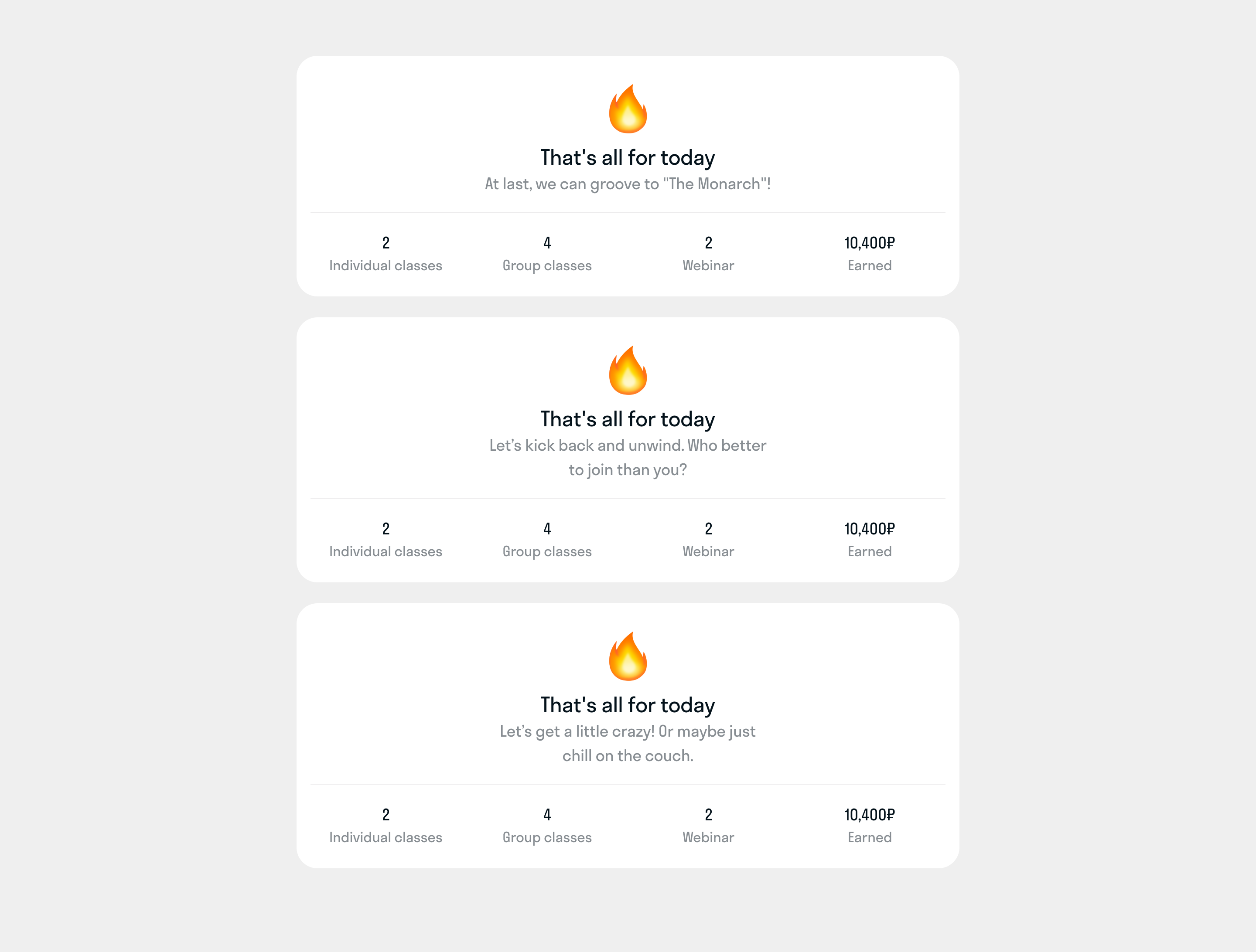
When all lessons for the day are finished, a card displays the day’s statistics along with engaging headlines
Results and Impact
Key Metrics After Redesign:
- 30% reduction in time spent on admin tasks (from 50 minutes daily to 35 minutes).
- 20% increase in lessons taught per teacher, leading to higher revenue per instructor.
The team is continuously refining and improving the new teachers’ portal design based on teacher feedback and quantitative data.