Context
From 2020 to 2022, Skyeng transformed from just an online English language school to a cool platform that offers a bunch of different courses for both grown-ups and kids in different study formats.
At first, we focused on making the desktop version awesome, so that all the new stuff we had could work smoothly. But then we realized that to meet the needs of all the users out there - whether they want to study alone or do their homework on the move - we had to make the navigation in our mobile app super easy to use.
Design Lead • Winer 2022 • Skyeng App
Problem
Skyeng’s mobile application initially only supported English language learning. This meant that the navigation was not designed to accommodate the addition of new subjects or formats. As a result, we were unable to provide our users with all the features available on the desktop version.
Process
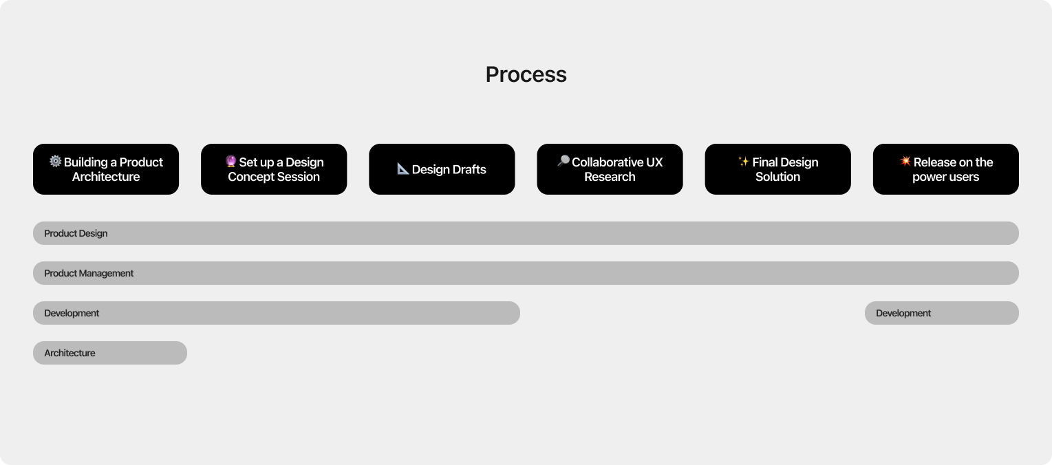
Working on the navigation involved a significant amount of organizing workflows, as changes had an impact on multiple teams and the product architecture. Therefore, it was crucial for us to establish a unified vision of the changes and ensure synchronization among all project participants right from the start.
Product Architecture
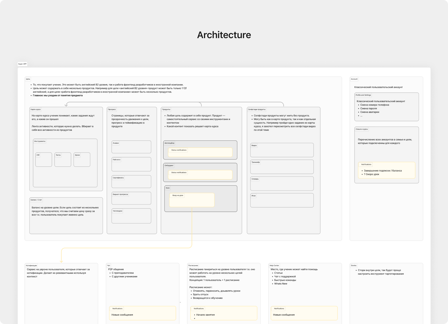
To ensure a clear understanding of the app’s frameworks and constraints, we began by creating an information architecture. This helped establish a shared understanding of the app’s building blocks and facilitated collaboration among project participants. By implementing a structured and organized framework, we improved communication and decision-making processes, resulting in a more cohesive and effective navigation design.
Design concepts session
Once we finished the product architecture, we conducted a brainstorming session to explore various concepts and ideas for the visual design and navigation of our product. The goal was to create a cohesive and unified visual vision for our product. To accomplish this, we assembled a team of nine product designers from different departments within the company, as well as three game designers. Our objective was to visualize the concept of the future product, taking into account three key pillars:
- Business strategy,
- The architecture we had created,
- User feedback.
Final Design
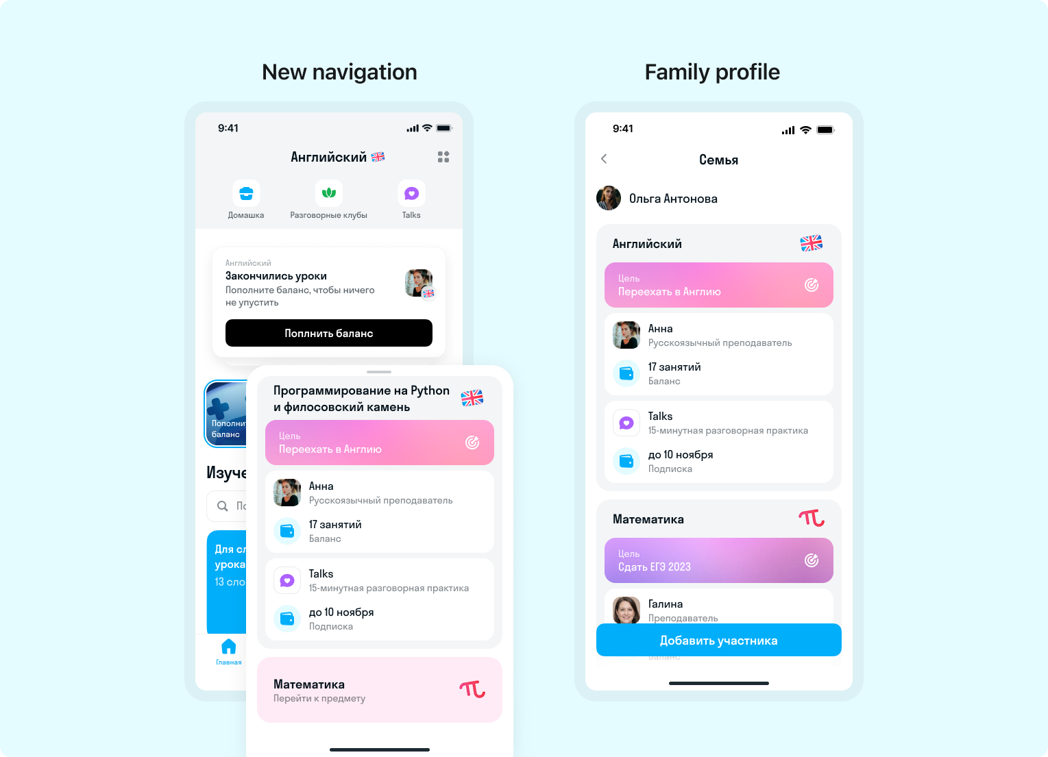
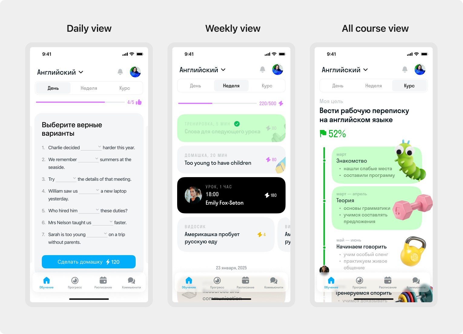
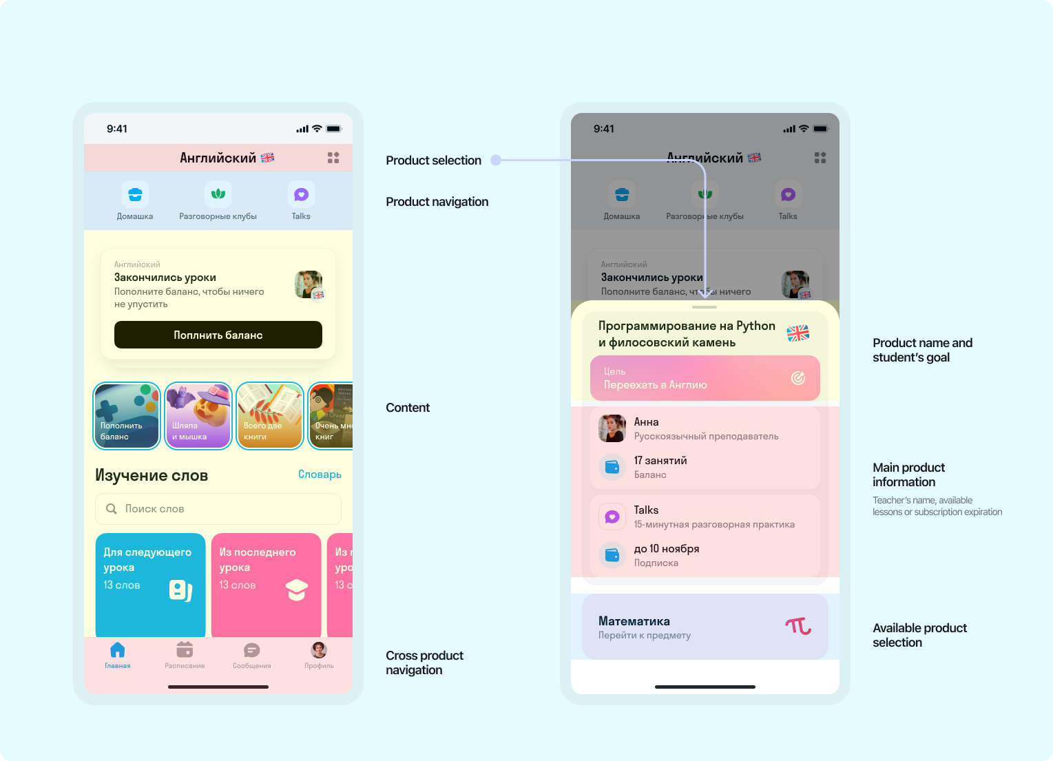
The main concept of the new navigation was to have a primary navigation for products and a secondary navigation bar for sub-products. For instance, the main product is English, and the sub-products consist of f2f lessons, Talks (15 min on-demand speaking sessions with native speakers), speaking club, and homework.
We grouped all elements that are used in multiple products, such as schedule, messages, and user profile, into a tab bar so that they can be easily accessed from any page.
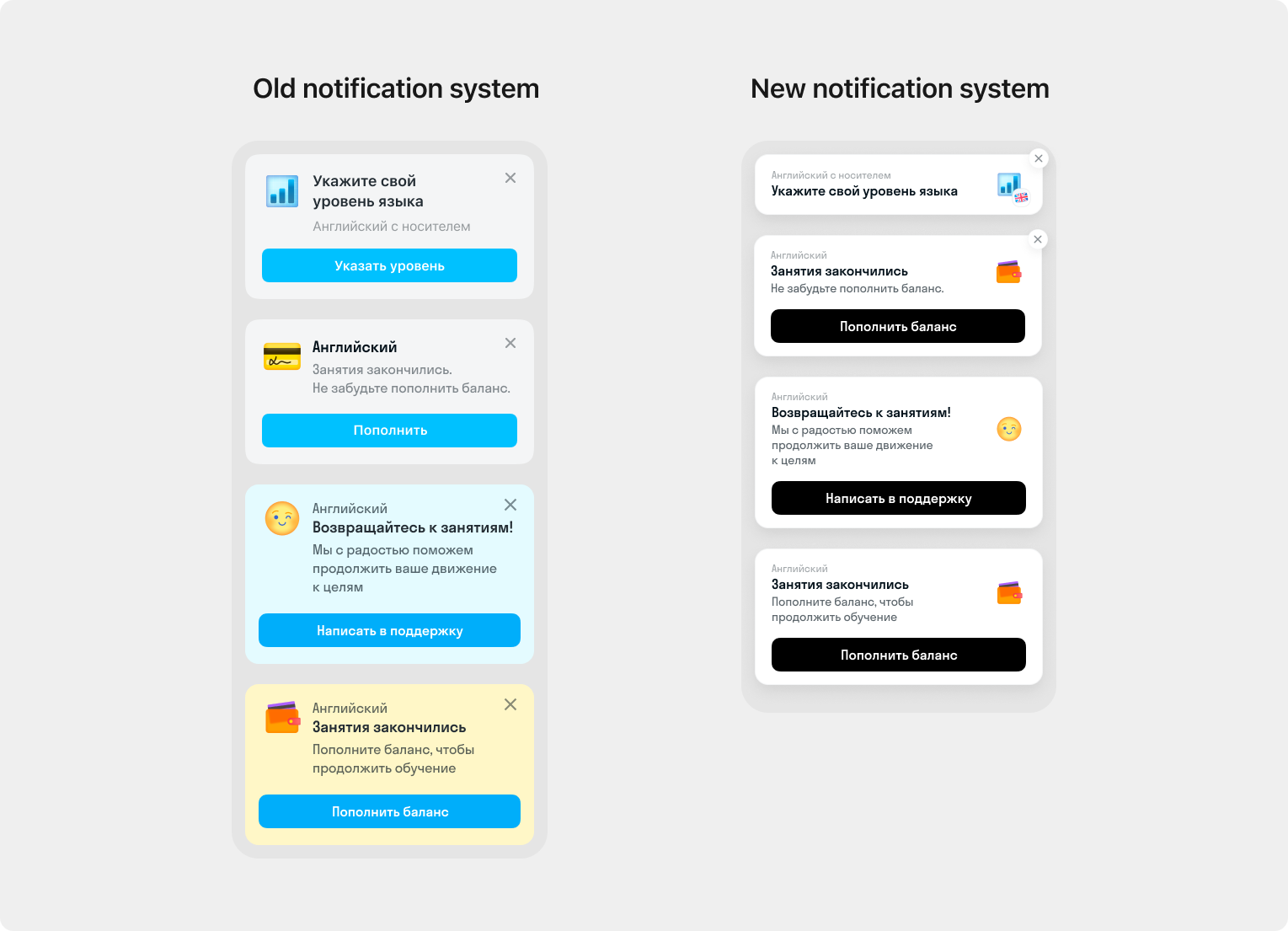
To rethink product navigation and implement numerous new user scenarios, we need to update and improve our notification system. This was necessary to create a more consistent, actionable, and timely navigation experience.
Results and impact
Prior to launching the new navigation, we conducted User Research using a prototype in Figma. The results were positive, as almost all participants understood how to use the new navigation.
Following the UX Research and making some improvements, we launched the new navigation to our power user group. We are currently testing the navigation and finalizing preparations for a full-scale launch to all of our users.