Context
Skyeng has multiple brands, including Skysmart for kids’ education and Skyeng for adults’ education. These brands and their products are closely related in terms of business and operations. However, they have two different web product layouts for products with the same user goals and scenarios.
Design Lead • Spring 2020 • Skyeng.ru
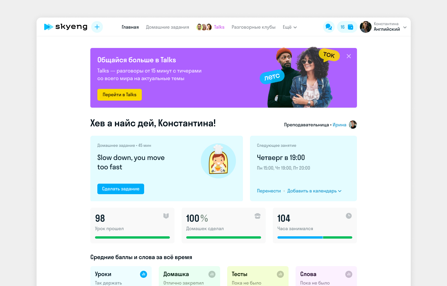
Problem
Historically, Skyeng has operated with two different layouts, which negatively impacts user experience:
- Children must switch from a kids’ platform to an adult one as they grow older. This transition could be smoother or unnoticeable due to the stark differences between platforms.
- When switching to the adult platform, children lose their progress and achievements because the two platforms have different goal and achievement systems.
- Families where both children and parents use Skyeng face difficulties due to the different platforms.
- Supporting two versions of the web layout—one for Skysmart and another for Skyeng—poses challenges. The support team must also maintain separate knowledge bases for both product layouts.
Goal
We aim to create a seamless, smooth experience on our platform by eliminating the division between adult and children’s designs.
Research
We conducted 10+ user interviews to understand how to eliminate the two platforms. After user interviews, we get some insights into how adults and kids similarly use the platform. There were three main scenarios when they opened Skyeng:
- Right before a lesson starts.
- When they have free time to make and complete their homework.
- When they plan next week, and they want to reschedule lessons.
Solution
We decided to continue working with the kids’ platform because:
- It already had well-developed product flows that covered the main scenarios.
- It offered personalization and customization based on the subject a student learns.
- It had a top NPS score, indicating that kids loved the platform.
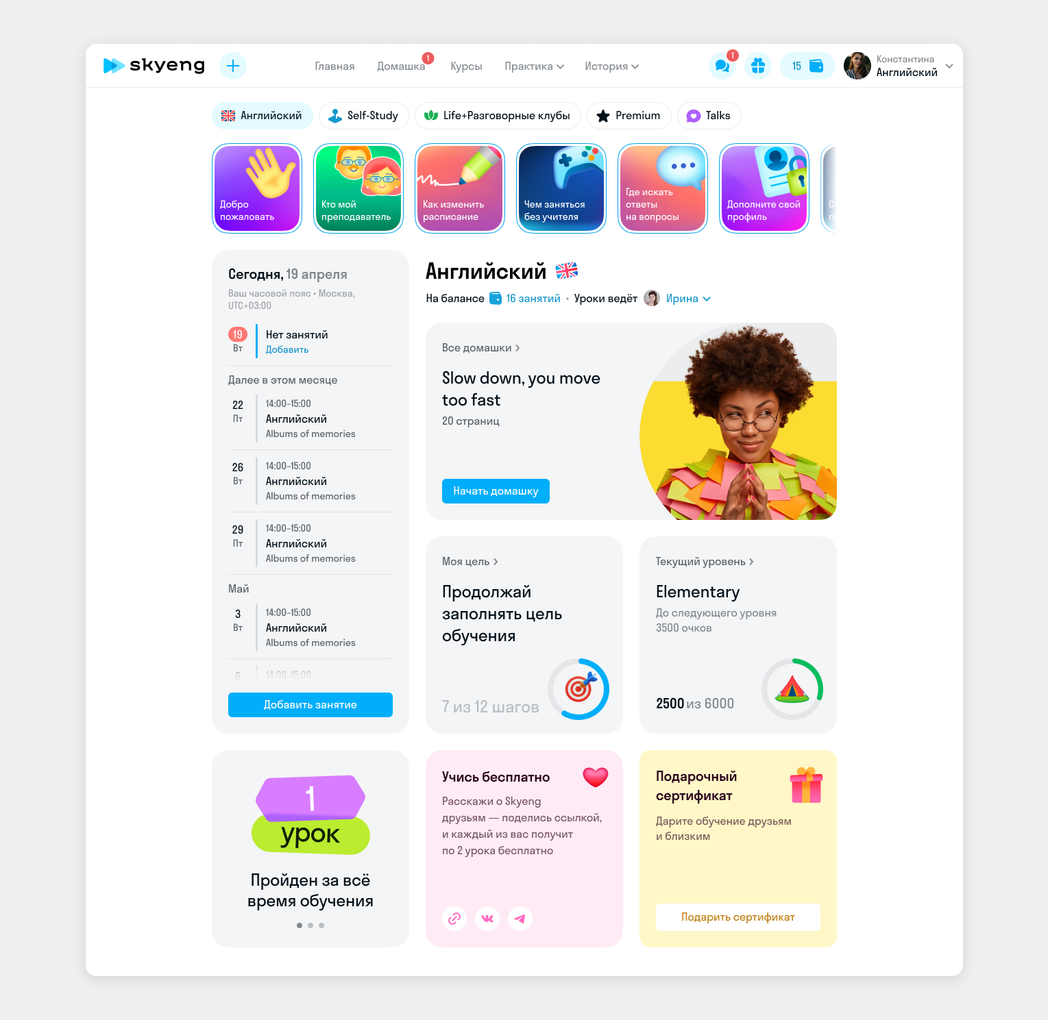
The main page structure
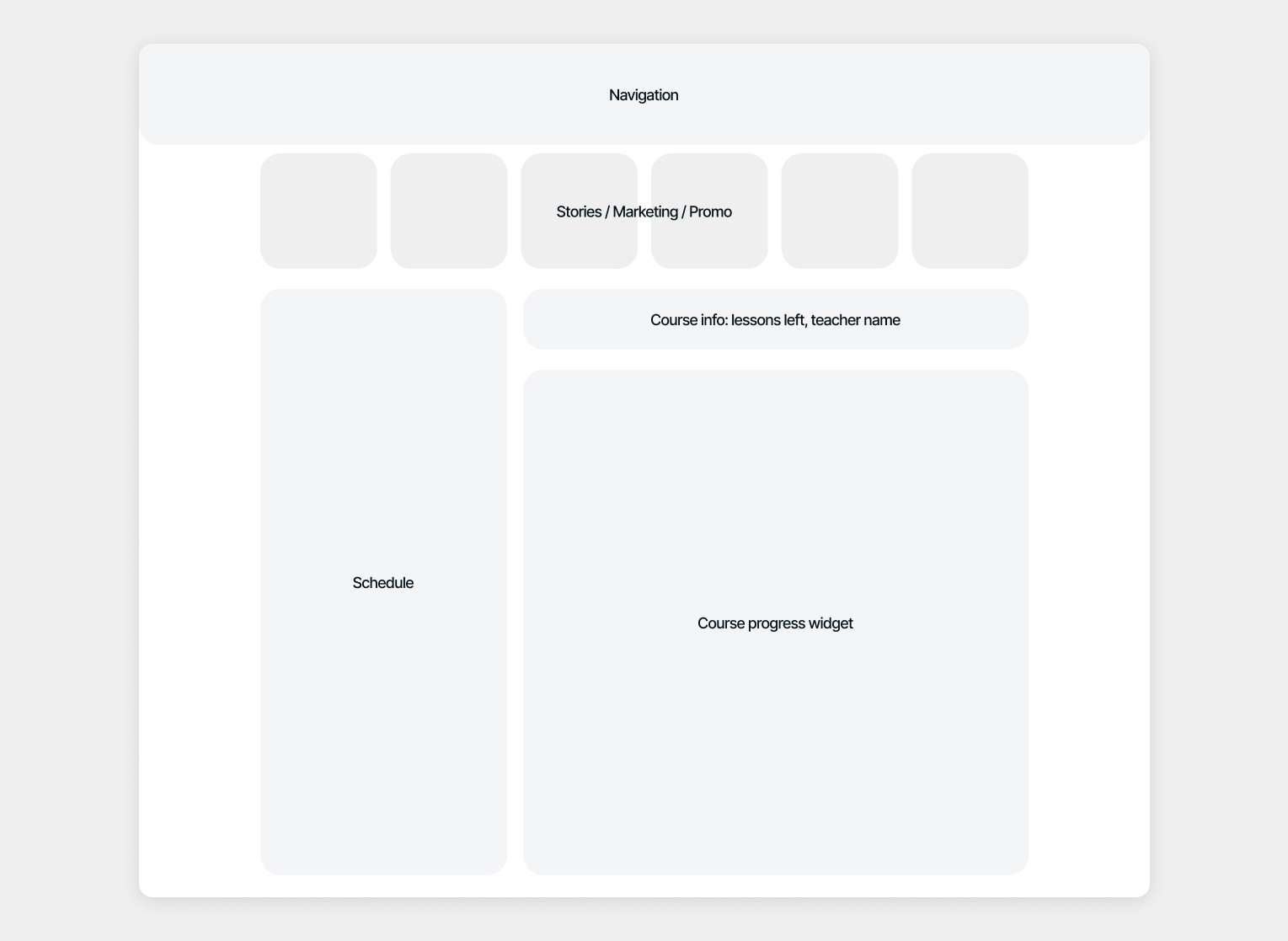
The main page has some crucial blocks in it’s layout:
- Navigation through other sub-products, self-study, and cross-subject navigation.
- Schedule, which shows all students’ lessons and allows them to cancel, reschedule, or add more.
- Course information shows a teacher and how many lessons are on a balance.
- Stories to be able to add some promo, helpful information, and product updates.
- And main course progress widget.
The course information widget
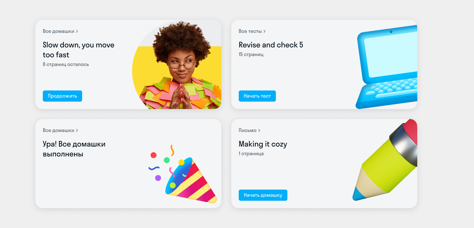
This widget adapts to student types, subjects, and goals. For example, students learning English for fun don’t have a personal study program. Instead, they see a layout with a prominent “next homework” block. Our research showed this was the main reason students returned to the platform.
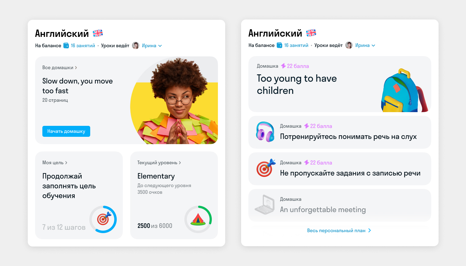
For students with a personal study plan, the layout changes slightly. We display more detailed information about their plan, including homework, self-study activities, future lessons, and their themes.
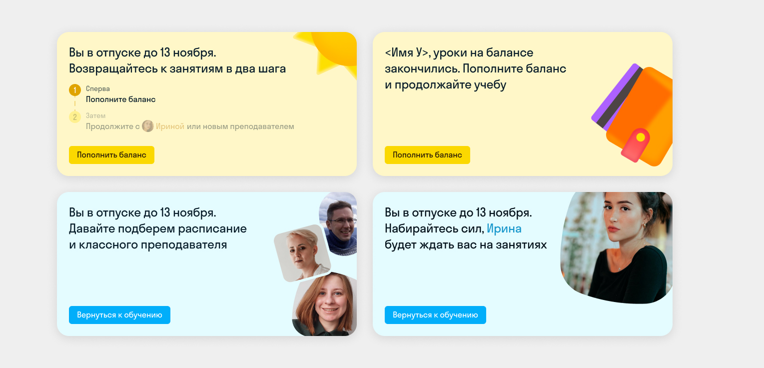
When service messages are necessary—such as when students have no lessons on their account, or a teacher is going on vacation—we show only one widget in the information block. This is because it’s the most critical information for students and requires their attention.
Results and Impact
- We migrated 100% of students to the new unified platform without dropping the NPS score.
- Reduced development and support costs by 20%
- Based on UX interviews, 90% of adult students love the new layout.