Context
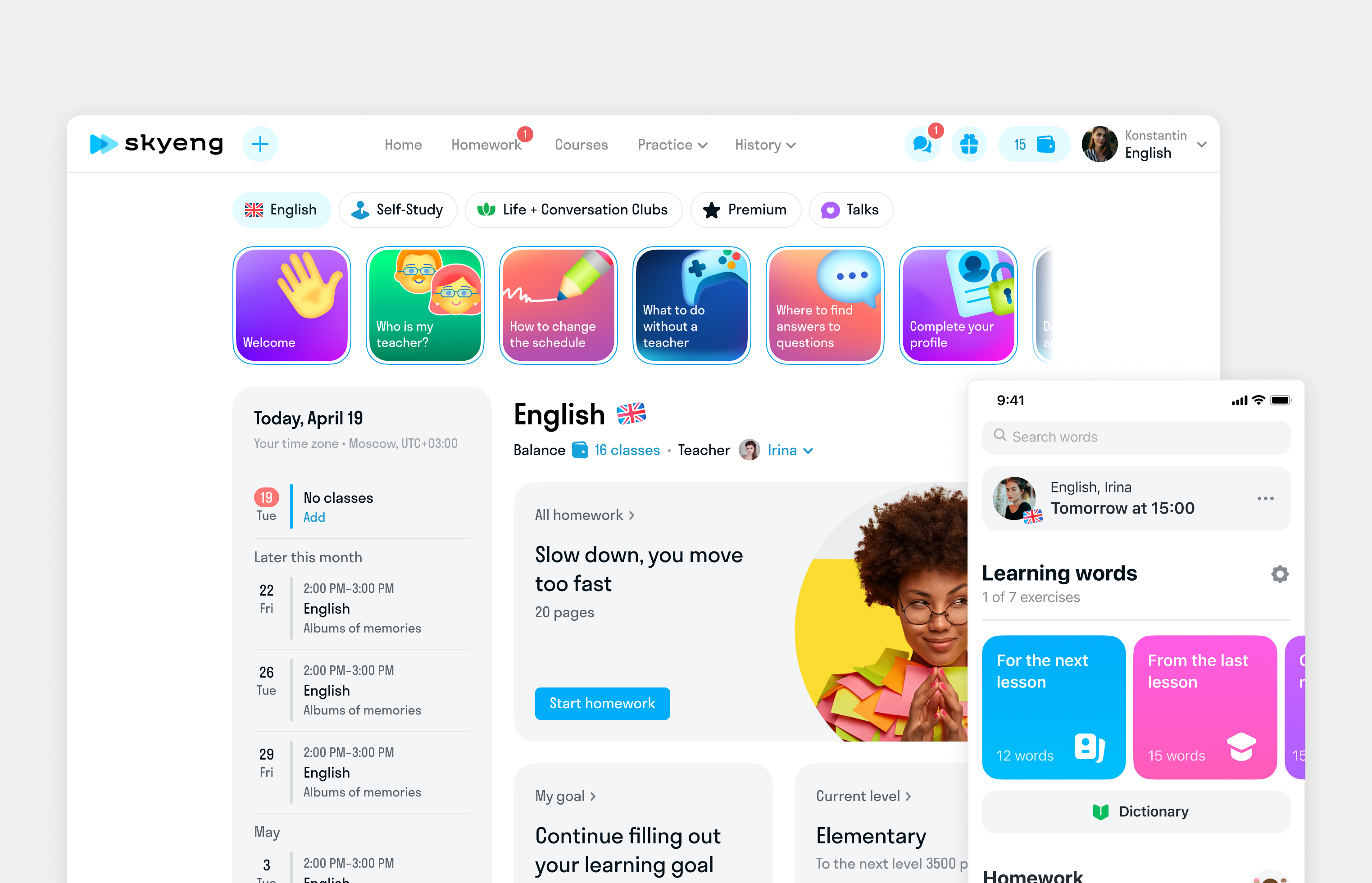
Between 2020 and 2022, Skyeng evolved from an online English school into a comprehensive educational platform offering diverse courses for both adults and children. This transformation posed significant challenges since the app’s architecture was originally designed for teaching English alone. We needed to reimagine the mobile app — particularly its navigation — to accommodate an expanding range of subjects and learning formats.
Design Lead • Winer 2022 • Skyeng App
Problem
Problem Statement
The business aimed to increase revenue per user (RPU) and enhance student engagement. Analytics indicated that most users primarily interacted with online classes and homework, spending little time on the platform outside of these core activities. To maximize lifetime value, the company focused on:
- Encouraging deeper engagement within the app.
- Increasing cross-sales of subjects that were already available on the web platform.
However, the existing navigation system became a barrier to growth, hindering efforts to drive both engagement and revenue expansion.
We required a more adaptable navigation structure to facilitate growth. Our goal was to develop a scalable, intuitive, and user-friendly navigation system that could support our complete range of educational offerings.
Solution
Process
Working on the navigation involved a significant amount of organizing workflows, as changes impacted multiple teams and the product architecture. Therefore, we needed to establish a unified vision of the changes and ensure synchronization among all project participants immediately.

Product Architecture
We needed to ensure our navigation aligned with our product’s strategic vision while providing design coherence and scalability.
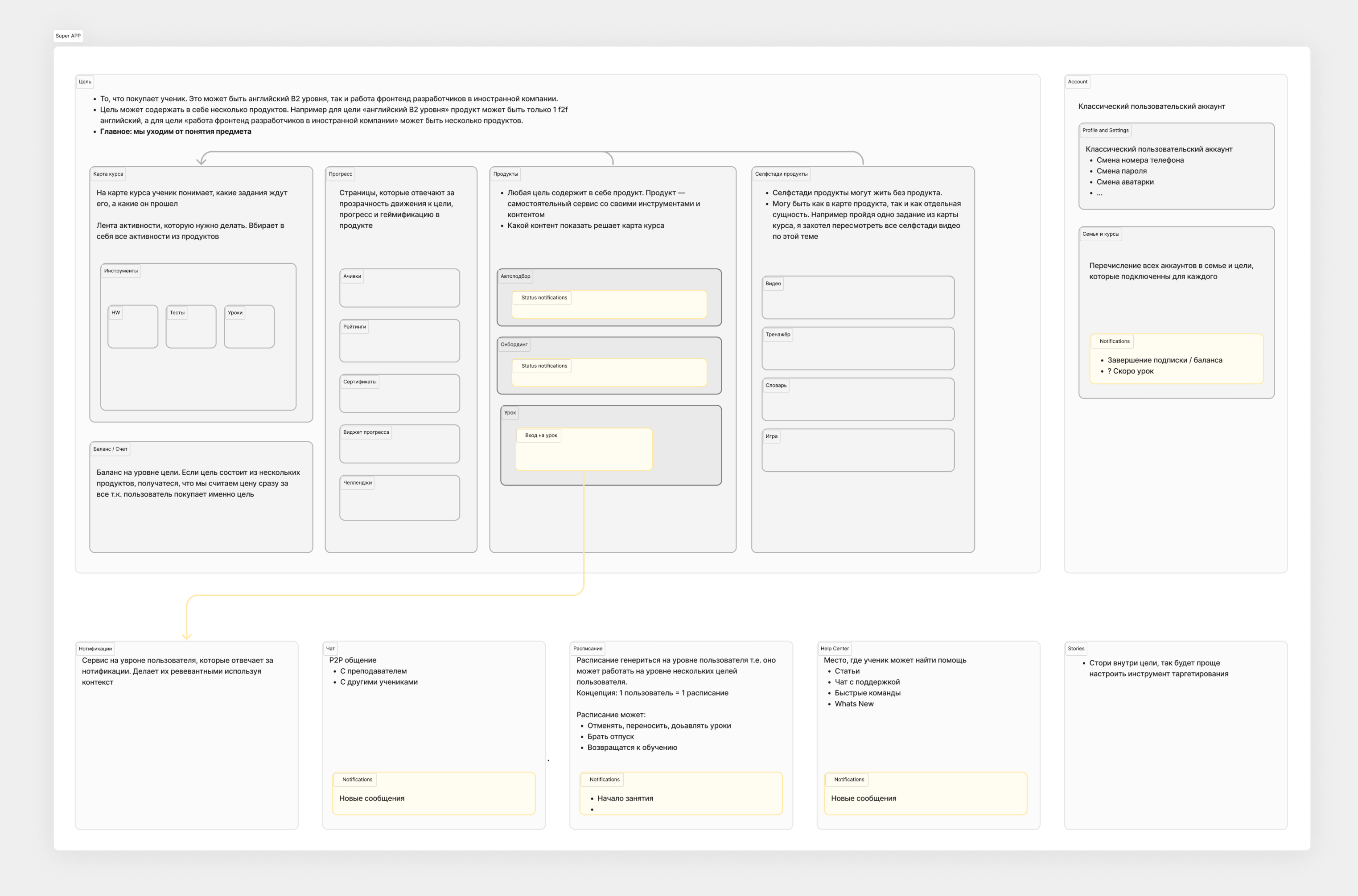
Since the navigation changes affected multiple streams and teams, we needed to create a space where everyone could align around the same problem and share a unified view of potential solutions.
We, therefore, began by designing a product information architecture to identify the main components of the product structure, logic, and navigation.
Design concepts session
After completing the product architecture, we held a brainstorming session to explore concepts for our product’s visual design and navigation. We brought together nine product designers from across the organization and three game designers to generate innovative ideas. Our session focused on three key areas:
- Business Strategy: Creating navigation that supports Skyeng’s long-term vision of expanding course offerings.
- Architectural Integrity: Maintaining system boundaries while ensuring flexibility for future growth.
- User-driven design: Incorporating user feedback to create intuitive and functional navigation.
Final Design
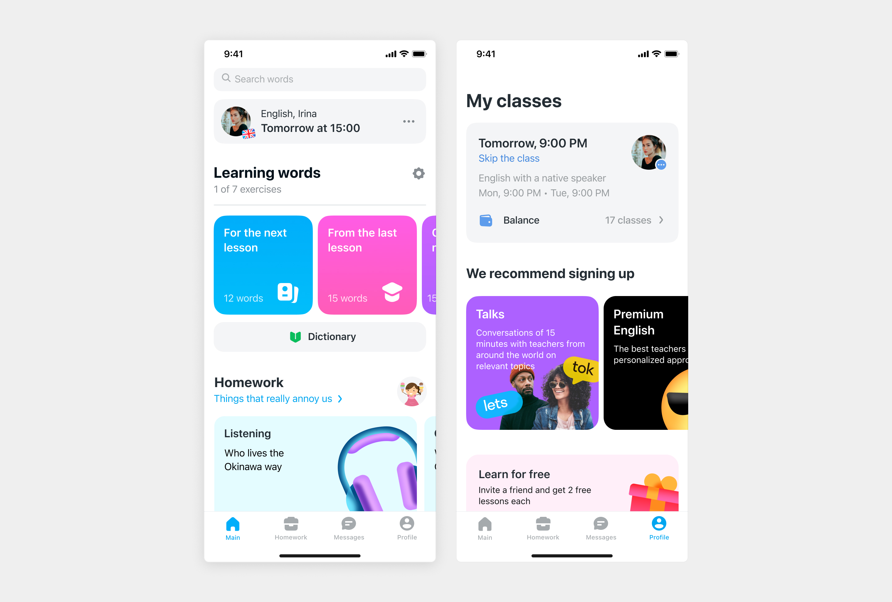
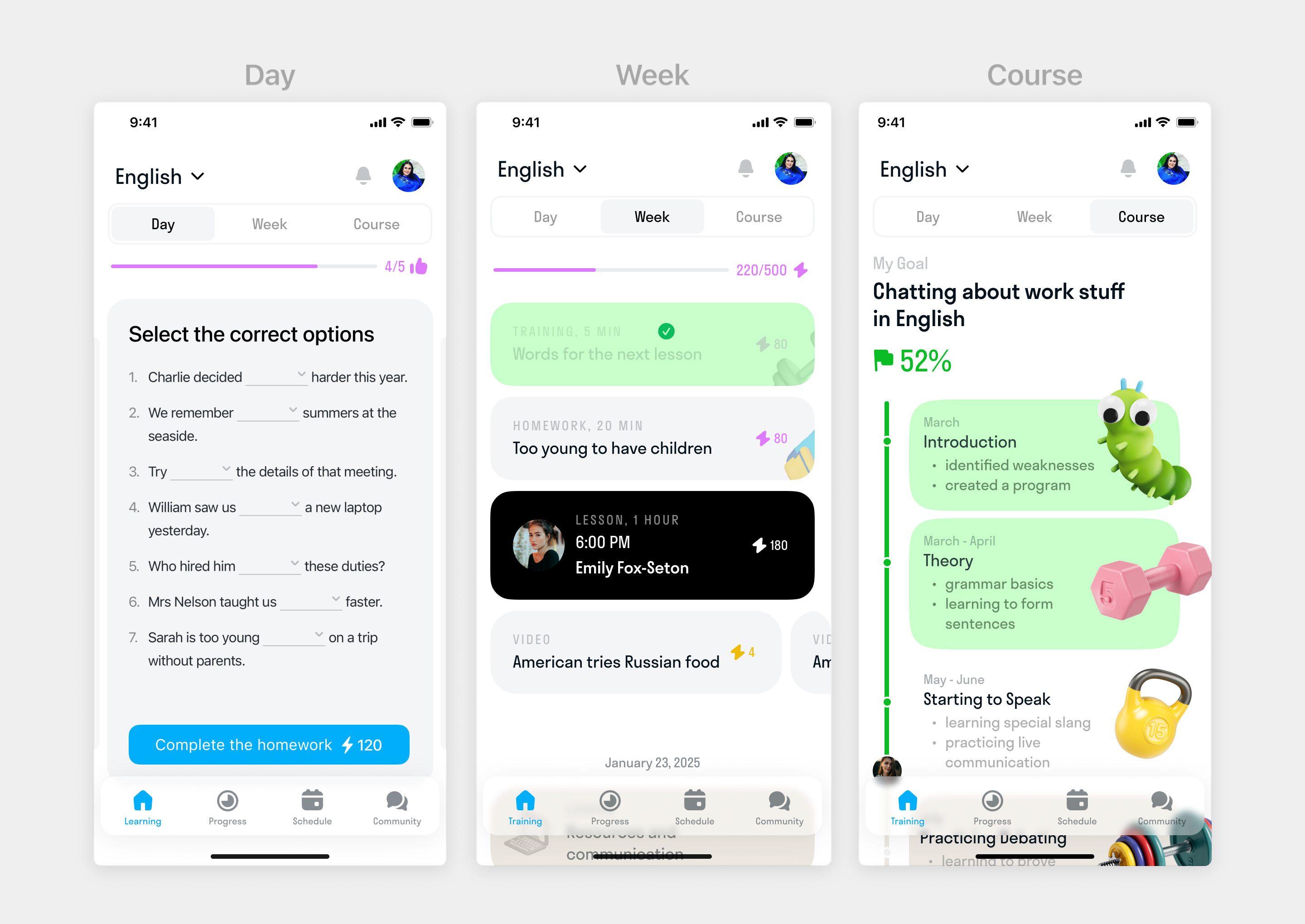
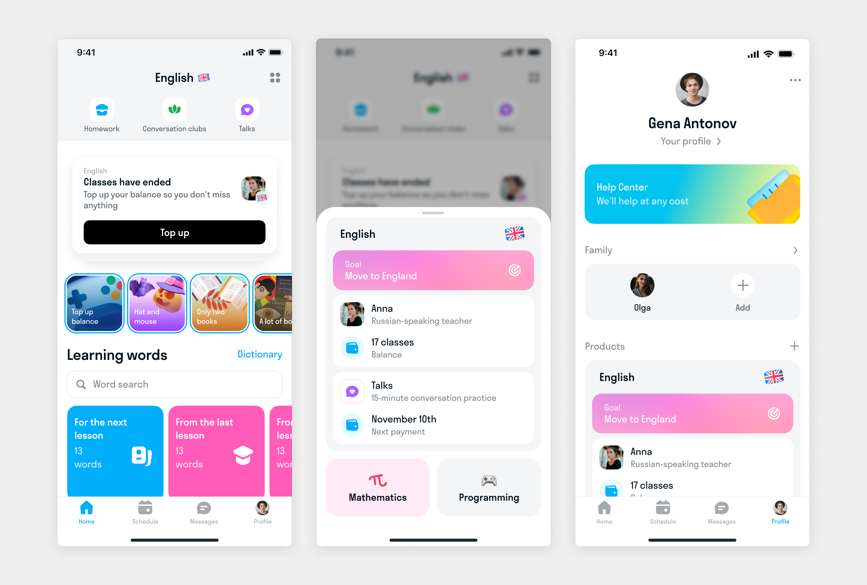
We focused on designing navigation that helps students find their learning products/subjects, shows all available services for each product, and provides universal navigation across Skyeng’s variety of products, services, and learning formats.
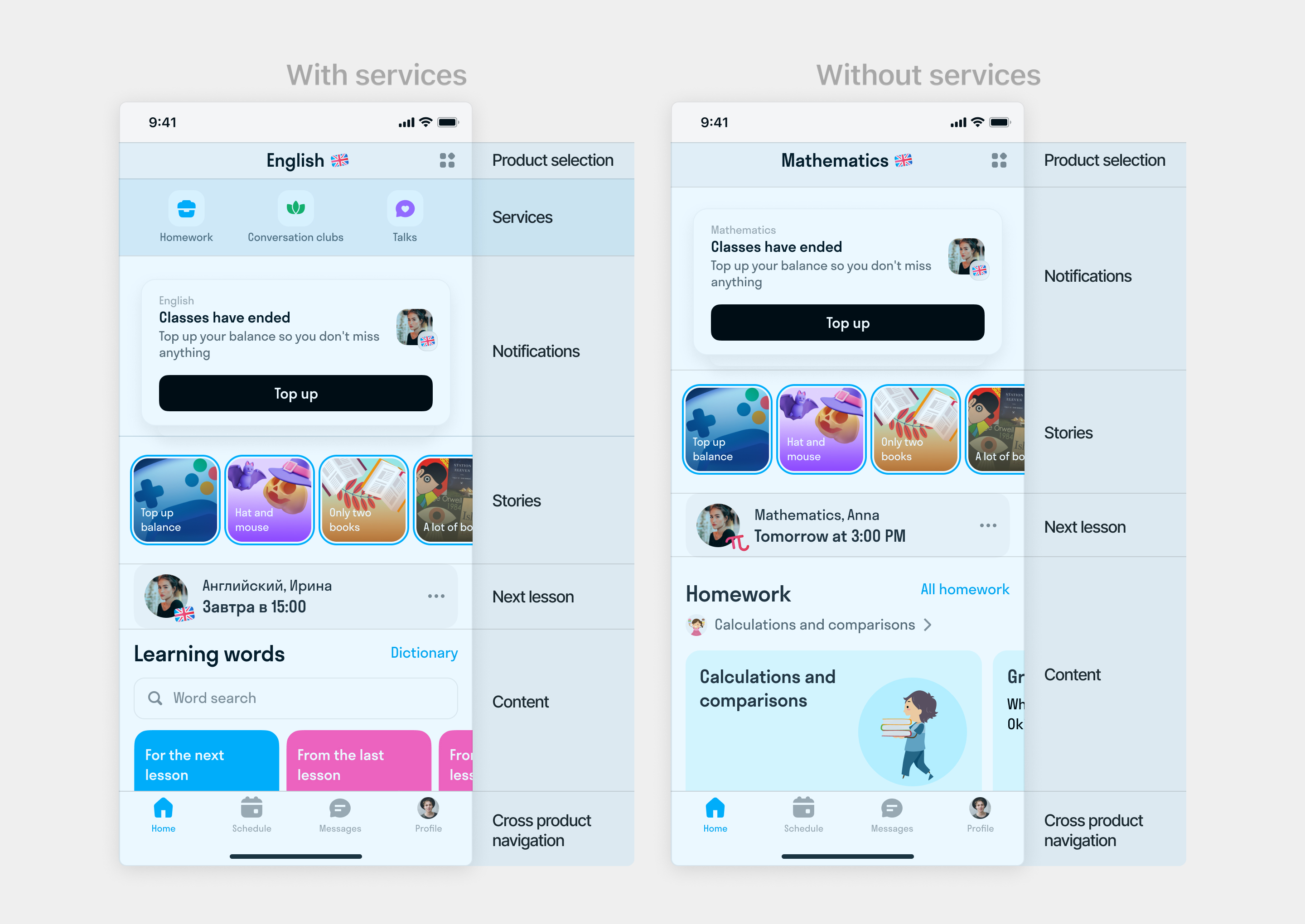
The navigation should works well for all product types. While English offers multiple services like conversational clubs and Talks (speaking practice), other subjects like math only include homework assignments. For math-like products, the Services navigation remains hidden, with homework displayed as a single service on the product home page
We also combined some universal elements, such as schedules, messages, and user profiles, into a tab bar to make it easy for users to reach any place to find the essential features irrespective of where they were on an app
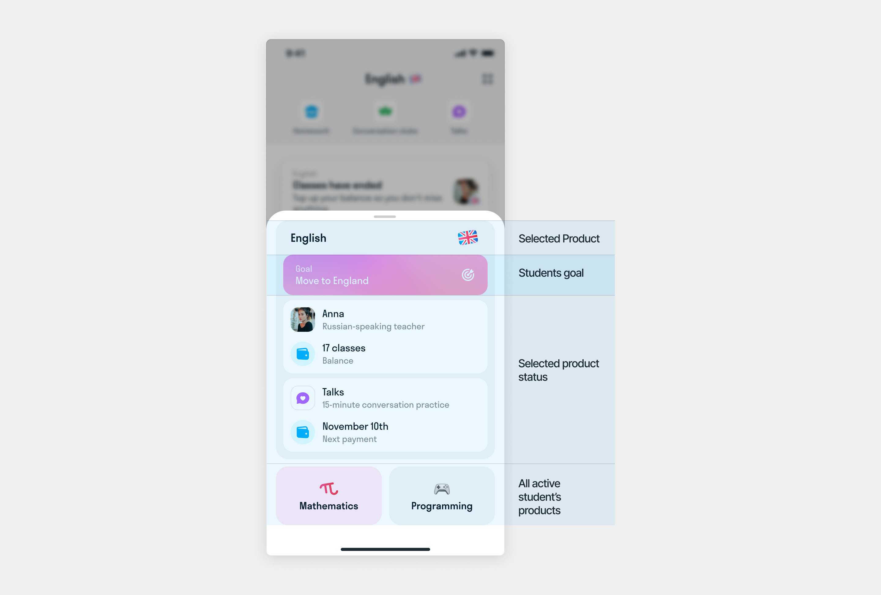
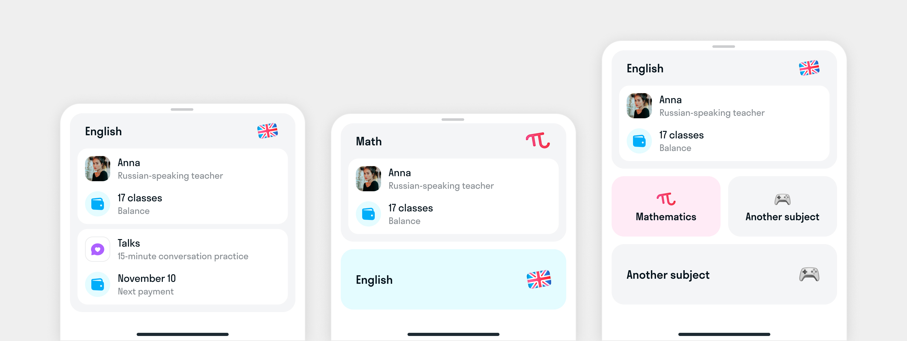
When students tap on the Selected Product at the top of the screen, a product information bottom sheet appears. It shows details about the selected product and other products the student student have.
UX Testing
After creating the initial screens, we conducted usability tests with our students to verify they could understand and easily navigate the new design.
Results:
- 100% understand where to find the entry point for switching between subjects and received the pull-down menu positively
- 9/10 responded positively to the additional navigation block at the top
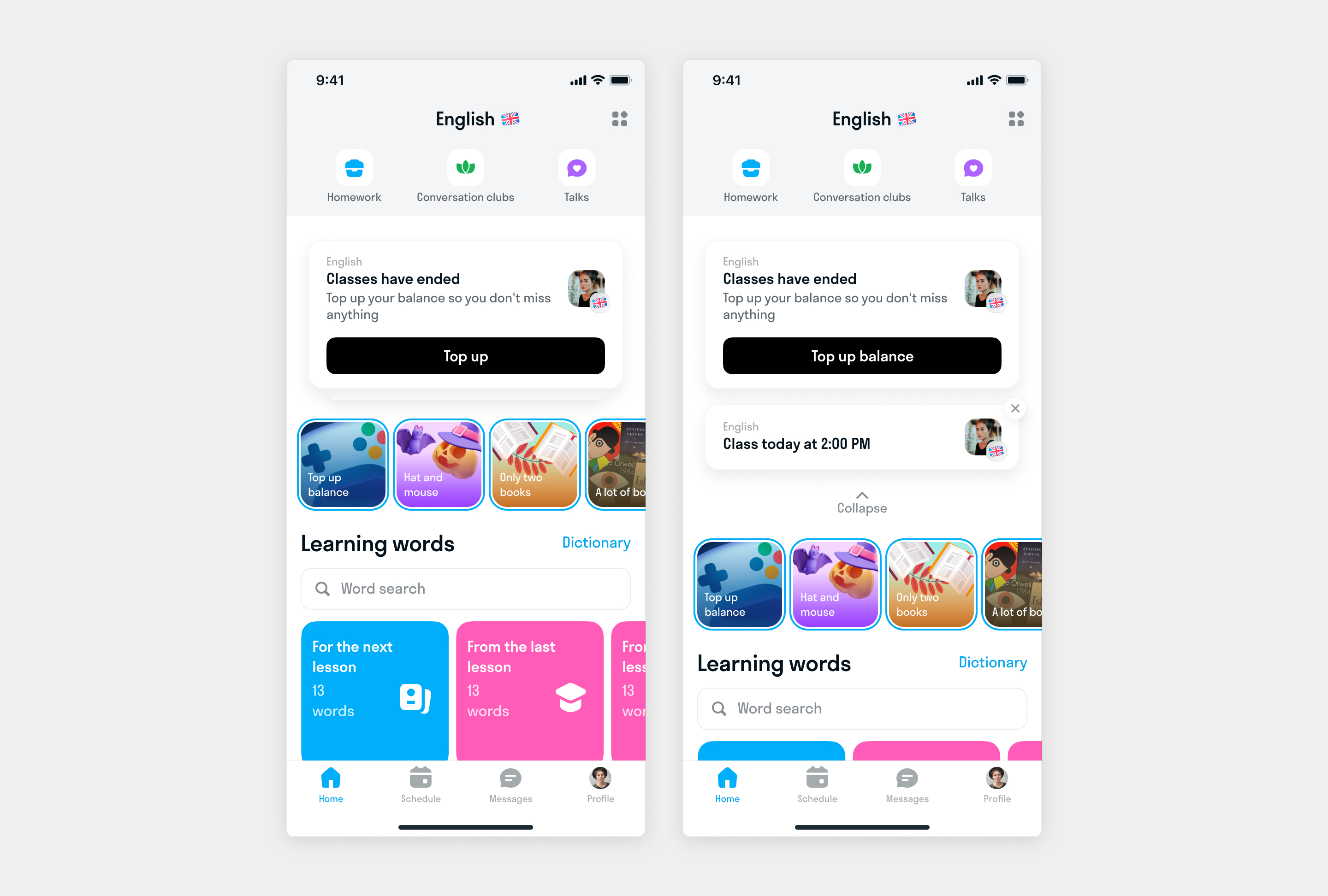
Enhancing the notification system
While we were working on new navigation we realized that we have to redesign how notifications works. Because now user can have more than one product in the app, each product services.
We divided all notifications into two groups:
- Action notifications: These are the most important notifications that can affect the study process. They have action buttons and appear across all products. For example, if a student needs to top up their balance for English classes, they will see this notification whether they’re in English or math.
- Status notifications: These are informational notifications that appear only for the selected product. They don’t require action from users and can be dismissed.
Results and Impact
We conducted user testing with a Figma prototype before launching the enhanced navigation. The feedback was overwhelmingly positive: over 90% found the new navigation intuitive, reporting a better overall experience than the prior navigation. After incorporating minor improvements based on feedback, we rolled out the new navigation to a subset of power users. Testing showed increased user engagement with additional course offerings.
Next Steps The team is preparing for a full-scale launch of the new navigation system